BajaNomad

WHEN/HOW TO IMPROVE PHOTOS?

Pompano - 12-29-2009 at 06:41 AM

I recently bought a couple of very good digital cameras. The one I am using the most is a Nikon D40 with the standard lens..I guess? It's a 3.0x AF-S DX Zoom-NIKKOR 18-55mm.

Anyway, I like this camera. It's user-friendly and fits my hand pretty well. I am slowly learning more about it's functions and multiple options, but mostly use it in the 'auto' mode for fear of loosing the shot with some settings error I might make.

Anyway, so far so good on the camera part.

The question I have right now are the choices I have after I download the pics onto my computer. At this point, I have a few options that my pc programs offer. Like: using Picassa to 'enhance' a particular shot..or leave it alone in it's original form.

There is one feature on Picassa that I am experimenting with lately. It's the 'I am feeling lucky' enhancement setting. It's kind of a one-stop fix-it-all setting. Great for us neophytes...At least I think it is...maybe not?

Here's what it does:

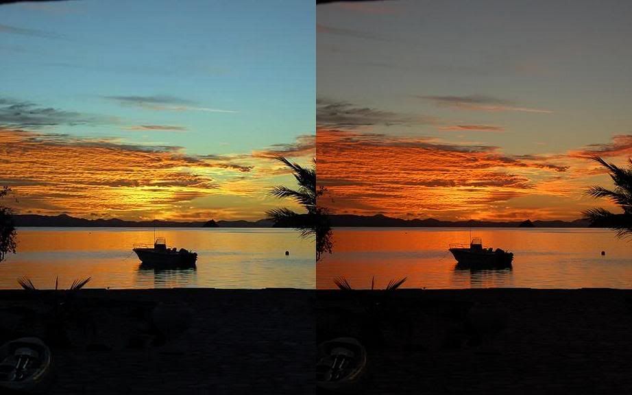
.............................The left side is ENHANCED (feeling lucky) ....................................and the right side is the ORIGINAL.


...................................................ENHANCED.........................................................................ORIGINAL ............................................


.

What do you think? Enhance it? ...or Leave it alone?

Your opinions please.

Muchas Gracias.

.

Ken Bondy - 12-29-2009 at 07:01 AM

In my opinion both images are very presentable. I would like either the unenhanced or the enhanced version if I saw either alone. The program is just changing the color levels, adding more blue and some saturation. That's just an "in the eye of the beholder" thing. You are starting with a good image and Picasa is merely changing it to another good image. It would be interesting to see what this Picasa function does with an image with a good subject that is technically incorrect, like underexposed a few stops. If it can salvage that condition it would be very helpful.

Russ - 12-29-2009 at 07:18 AM

Wow! I like the way you showed the before & after. Since I'm a Mac user I use their iPhoto program most of the time. You can play with the sliders and see what changes you're making as you play.

iPhoto.jpg - 47kB

shari - 12-29-2009 at 07:48 AM

I use picasa alot but rarely like the "feeling lucky" option as I usually prefer the original to it...I prefer to tweak photos with the other options....as ken said, it usually comes out too blue for my liking.
I prefer Photoshop when I want to really get a photo nice...and use the sliders Russ mentions to get the photo how I want it on both ends of the scale...light and dark....but picasa is easier, quicker and I like the upload features to size a batch of photos.

k-rico - 12-29-2009 at 07:51 AM

I think software should be used to fix photos
and perhaps to produce effects that correspond with the
context of where the photos are being used, like in an
advertisement. An example of a "fix", sort of, is I had my
portrait used for professional purposes photoshopped to
whiten my teeth. :biggrin:

Other than that, keep them untouched.

But I'm a newbie to photography also.

It would be interesting to know what the more experienced
photogs commonly do with software beyond cropping and
rotating (to fix an unwanted tilt).

BTW, I've been using this image editor for about 12 years.
Cheap and powerful. Paint Shop Pro


[Edited on 12-29-2009 by k-rico]

mulegejim - 12-29-2009 at 08:00 AM

Roger, I use Picasa a lot and for me it works very well. Email me if you have questions and I'll attempt to help. Jim

Pompano - 12-29-2009 at 08:16 AM

Aha! So how does one downsize a big batch of photos at the same time? Picassa-wise or otherwise.

David K - 12-29-2009 at 08:20 AM

In Photobucket, you choose the size before uploading them from your PC to Photobucket... Your photos are still slightly bugger than the standard 15" monitor screen and requires some scrolling to the right to see and read the text.

Here is from Photobucket: If you don't exceed 800 X 600, the Nomad page is not stretched...

More Upload Options
Resize my images to: Tiny ( 100 x 75 ) 1280 x 960
Small ( 160 x 120 ) 1600 x 1200
Medium ( 320 x 240 ) 2048 x 1536
Large ( 640 x 480 ) 2592 x 1944
15" screen ( 800 x 600 ) 3648 x 2736
17" screen ( 1024 x 768 ) 4000 x 3000
1 megabyte file size 2 megabyte file size


[Edited on 12-29-2009 by David K]

shari - 12-29-2009 at 08:24 AM

just click on whatever photos you want to get em in your tray...then click on export and a screen comes up with size option and enter where you want the file to go...i use between 400-480 which usually gives me photos around 50 kbt to post on the internet....all the photos get exported to a file at a smaller size.

David K - 12-29-2009 at 08:27 AM

When the photos are hosted on another web site (such as Photobucket.com/ VivaBaja.com/ BahiaAsuncion.com) there isn't a file size limit of 50 KB for Nomad posting. That is only if Nomad saves the photo when you use 'Browse' to directly show photos that are on your PC.

Mexicorn - 12-29-2009 at 08:33 AM

I konw this may sound dumb but you guys please explain how to attach photographs to my posts.
Thank you in advance
The Mexicorn-

David K - 12-29-2009 at 09:05 AM

Quote:
Originally posted by Mexicorn
I konw this may sound dumb but you guys please explain how to attach photographs to my posts.
Thank you in advance
The Mexicorn-


Here is a the post ...

A review of three methods from an older thread... for the new Nomads or the PC challenged Nomads... Note: there are many methods, and I suggest you go to the older thread where 'everyone' provided their favorite... the following are MY prefered methods, and I want to keep it as easy as possible to help folks who are photo posting challenged.

A) ADDING A PHOTO THAT IS IN YOUR PC PICTURES FOLDER:

A photo that is in your computer file can be displayed on Nomad pages in certain forums where it is allowed...

The photo's file size must be BELOW 50 kbs to post here. Open your photo file ('My Pictures' or ?) find the photo you want to share and move your mouse arrow onto the photo thumbnail... a pop up will tell you how big it is in kbs or mbs (1000 kb=1 mb).

TO POST A PHOTO:

Simply click the button labled 'Browse' just below where you type a message, and your pc will pop up a window of your photo files... simply click on the photo you wish to post (if it is under 50 kbs). The post must have a subject or some text with the photo to post.

IF your photo is over 50 kbs, then here is one method to reduce the size, and make it a duplicate (so the original full size photo is preserved). I thank Neal Johns for showing me.

(If the photo you want to post is already on another web site, then you may 'hot link' it to Nomad, and the size doesn't matter... unless it isn't too big and distorts the screen. Hot linking will be described below.)

PHOTOS IN YOUR PC OVER 50 KB, click on each step:

If 'paint' isn't on your deck top, do this (click on):

a) Start

b) All Programs

c) Accesories
---------------------------------------------------------------------------
1) Paint (start here if 'paint' is on your desk top)
---------------------------------------------------------------------------
2) File

3) Open...

3a) then click on the photo to get reduced (double click).

4) Image

5) Stretch/Skew... then change the % down from 100 in both boxes in sketch to a lesser number.... (if over 700 kb try 25%, if 400 kb try 35%, if 120 kb try 70%, if 60 kb try 90%)

Continue to Click on:

6) OK

7) File

8) Save As

8a) now type in a new name for the reduced photo or add -r to it to indicate it is the 'reduced' one... this is a copy so you don't mess with the original.

9) Save

THAT'S IT!

Now, click on file and open again, move your mouse arrow over the reduced photo and see if it is between 25 and 50 kb.

When you move the mouse over the reduced photo in the files, the kb size will show and let you know if you didn't get it low enough, or too low! In either case, repeat the steps above... working with the original, large photo.

After you do a couple it gets pretty easy.

=====================================================

B) HOT LINKING FROM ANOTHER WEBSITE:

If the photo you want to show on Nomad is already on another web site, and it is your photo or you have permission to use it, then get the url of the photo... and click on
which is right above where you type a message. A pop up will give you a place to paste the url of the photo.

To get the url (begins with http:// ), move your mouse over that photo and right click on it, then left click 'properties' in the new pop up. Copy the address/ url with your mouse to paste on Nomad in


Here is a hot link from my web site:


If you have your photos on a photo album web site, there may be a direct link option that will have the html tags ([img]) already included... see Photobucket.com instructions below...

======================================================

C) PHOTOBUCKET.COM

Photos can be copied onto your (free) photobucket.com album from your PC files... just pre select the size reduction setting as 15" screen or smaller... not 17" and not 1 mg. so the Nomad board doesn't get streched wide requiring awkward right scrolling to read messages.

To show any photos on Nomad, put your mouse on your photobucket photo, and a drop down menu will appear with these four choices and a url or 'code' next to each... for that photo:

Email & IM
Direct Link
HTML Code
IMG Code

Copy the last one (IMG Code), and paste that right on the Nomad page where you type a message... where ever you want the photo to appear in your thread.

===================================================

MAY THE FORCE BE WITH YOU!:light:

longlegsinlapaz - 12-29-2009 at 09:07 AM

Pompano, since you asked....I'm with Ken....original pics you've shown here have more warmth & color to them, the "enhanced", IMO, are washed out & colder when you compare them side to side. Don't mess with success!:bounce:

Mexicorn - 12-29-2009 at 09:12 AM


like this?

mulegejim - 12-29-2009 at 09:24 AM

I guess that's why they make chocolate and vinilla - I actually like the "feeling lucky" results better, however, they both are great shots. Jim

ecomujeres - 12-29-2009 at 09:51 AM

Pompano, re your original question about the photo fix. I actually see the fixed photos as being brighter and more pleasing (the white balance of the sky has been corrected so that it is blue rather than grayish).

With the photos you showed, I'd then go a step farther and darken them (reduce the brightness setting) just a tad so that they don't appear washed out. This is a common fix I use in Photoshop, especially for photos taken in the shade, where colors become more grayish.

BTW, Great shots.

DianaT - 12-29-2009 at 09:52 AM

Roger,
It really is a matter of taste---with your lovely photos, some I like the original better and some I like the "lucky" fix better.

Since I shoot most of my pix in the RAW format, they all require at least some processing and most photography books I have read say that some color adjustment is necessary for almost all digital photos. However, only once in a while does the auto work for me.

But photoshop is convenient because sometimes one may take a photo underexposed for a reason, or want to change to B & W or sometimes there is pole that you could not avoid with shot, so it gets cloned out. Or there may be noise that needs to be worked on, and a little sharpening is convenient.

But in learning to use photoshop, and I am just beginning as it overwhelming, it is easy to over-do the correction---real easy.

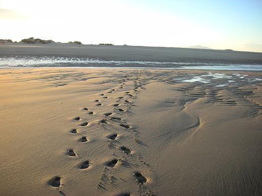
And sometimes it is just fun to turn this


Into this


I have not met a photographer who does not tweak his photos in some way or another. One professional landscape photographer I met recently has returned to using film. He uses those huge monster cameras, takes at least 4 images of the same thing with different settings---each image costs about $20.00 to process---then he puts them all together on the computer and adjusts everything.

So, it really is a matter of what pleases you----and no matter what you decide, everyone is enjoying your pix.

Have fun

BTW---that flower is a Baja flower.

[Edited on 12-29-2009 by DianaT]

ELINVESTIG8R - 12-29-2009 at 10:36 AM

Hey Pompano I liked the clarity of the one on the left but the one on the right adds the warmth. I like the right one better. I don't know how explain it any better than that.

Ken Bondy - 12-29-2009 at 10:40 AM

Just for kicks, and because I have no life, I took Roger's first (unmanipulated) image, brought it into Photoshop (CS3), and used the "Autolevels" function. Here's what I got. I think it is very similar to the enhanced image produced by Picasa:


Packoderm - 12-29-2009 at 11:08 AM

I like the original ones better. You might want to sample both for some printed images to see which works better.

DENNIS - 12-29-2009 at 11:45 AM

Here's a good, affordable program to play with.

http://www.amazon.com/Corel-Painter-Essentials-Win-Mac/dp/B0...

BajaNomad - 12-29-2009 at 04:22 PM

http://www.gimp.org

http://en.wikipedia.org/wiki/GIMP

:coolup:

[Edited on 12-29-2009 by BajaNomad]

LaTijereta - 12-29-2009 at 10:12 PM

Quote:
Originally posted by Ken Bondy
Just for kicks, and because I have no life, I took Roger's first (unmanipulated) image, brought it into Photoshop (CS3), and used the "Autolevels" function. Here's what I got. I think it is very similar to the enhanced image produced by Picasa:


I also use Photoshop "CS2" , and it helps to clean up background noise with most images...
It works best to see both images side by side, and adjust manually as needed.
I am currently scaning about a couple of thousand slides through a Nikon CoolscanV I pickup earlier this year.
The Photoshop program sure is bring these old "chromes" back to life:cool:

BACKGROUND/FOREGROUND - HORIZONS - CENTERING

Pompano - 1-3-2010 at 05:50 AM

Many thanks for all the helpful suggestions and comments. I have a few more Baja pictures to post, you know! And my photo-knowledge quiver could use some more arrows.

I'm making some progress, and mostly having great fun, in learning newer and better photo techniques.

Your responses on enhancing an image were very helpful.

Now I am interested in:

1. BACKGROUND/FOREGROUND

Say you want to take a picture of an object, or of a person, and you have some choice of what will be in the background. How much subject matter is suitable in the photo frame? What are you opinions on these next three (3) photos and the amount subject matter they contain?


Do you think they are...Okay...Too much...Not enough??

Which one/s do you prefer?

Does anything give the photo character or make it more interesting?

How much subject matter should be in the background..or foreground?

You don't have to give an expert's opinion on this, I am interested in what YOU think makes a good photo. Your candid comments are sought...and thanks!


PHOTO 1 - background/foreground


PHOTO 2 - background/foreground


PHOTO 3 - background/foreground

---------------------------------------------------------------------------------------------------------------------

2. HORIZONS

I am trying this...putting the horizon either one-third of the way up the picture, or two-thirds of the way up, not halfway.
Here are 2 examples:


PHOTO 1 - one-third horizon


PHOTO 2 - two-thirds horizon


Again, your comments please?

-----------------------------------------------------------------------------------------------------------------------------

3. CENTERING

I am experimenting with not getting my subject dead in the center of the picture. So as to show off the background and add a nice 3D depth effect to the shot, I am moving the subject off to the side and taking in the background.

I was reminded of an often-mentioned very basic “rule” of composition: The rule of threes, aka the rule of thirds. I had just bought this nice Nikon D40 and noticed that I could have the display show a grid of three-by-three squares (like a tic-tac-toe) over the picture I was taking. I looked this up and found out about this rule of the thirds.

The rule basically says, divide your frame into three rows and three columns, roughly equal in width and height, like drawing a tic-tac-toe (i.e divide your picture into thirds, vertically and horizontally). See middle photo below. Now, try to align most (or the strongest) horizontal lines and vertical lines in your shot with the edges of the rows and columns (i.e. with the tic-tac-toe).

Like I said earlier, have the horizon be either one-third of the way up the picture, or two-thirds of the way up...not in the middle or half-way.

Also, try to put your subject (or whatever details of the picture are important or draw the eye) on one of the four places where the tic-tac-toe lines intersect. This will make your pictures appear expertly composed (and incidentally will make for better computer wallpapers, leaving room for your icons).

Here are some examples for you:

PHOTO 1 - centered subject


PHOTO 2 - grid (tic-tac-toe) photo form


PHOTO 3 - grid result


.

Well, what do YOU think of the Rule of Thirds? Thanks for your input.

DENNIS - 1-3-2010 at 06:56 AM

The Rule Of Thirds is primary for pleasing composition.
That said....rules, especially this one, are made to be broken. The subject matter at the moment will dictate the most effective composition.

Acuity - 1-3-2010 at 06:58 AM

My 2c. There has to be a reason for foreground and background. I think pic #1 has too much that doesn't add to the story. As for "rule of thirds" - it does work, generally. Images dead center usually don't. There are many other "rules".

Here are two books I (and many others) have found useful

The Photographer's Eye: Composition and Design for Better Digital Photos (Paperback)
by Michael Freeman

Within the Frame: The Journey of Photographic Vision (Paperback)
by David duChemin.

I think you need to learn and use the "rules" first, then you can decide when they are appropriate and when they aren't.

... and please keep up your postings - I love them!!

wessongroup - 1-3-2010 at 12:16 PM

Would agree with the Photoshop use.. it is still a very solid application.. albeit a bit slow, due to the learning curve, as noted by DianaT.. would also add, that if you don't use the application, and you tend to forget things.. it will be a real pain, as I'm always having to go back and re-read how to do things..

I don't use the application nor the rest of the "suite" of applications on a daily basis any more.. and there is really a lot you learn to use...

But, in many cases the work is worth the reward.. and if you don't mind doing things just like Ken did, you end up with even more flexibility in your photography ... a very useful and a lot of fun tool "Photoshop"

As usual, great shots, great information... thanks :):)

ELINVESTIG8R - 1-3-2010 at 12:38 PM

Pompano you is creative! I like the following photos of the ones you have changed!

PHOTO 2 - Background/Foreground (Can you fix the chair?)

PHOTO 1 - Horizons - one-third horizon

I don't think you wanted us to do anything on the tic-tac-toe one did you? It was more of a tutorial right?

chernefitter - 1-3-2010 at 05:26 PM

I like the left photos...a little brighter. Hey can I use your boat? J.K. John Orange.

Skipjack Joe - 1-3-2010 at 10:59 PM

Interesting thread to which I hope to add more with time. The foreground/background image I usually consider as a 'framed' subject. And I particularly like this one. The long side-to-side archway emphasizes the broadness of the horizon and greatly emhances the image to my viewpoint. I have taken the liberty to edit this image to bring this idea even stronger. I also tilted the horizon 1 degree counterclockwise to get the arch parallel with frame.

After resisting all forms of photomanipulation in the begining I have come over to embrace and use it judicially to improve digitally images. My experience with 'autolevels' has been so negative that I no longer even consider it with any image.

ASUBJECTCONTENT.jpg - 50kB

Pompano - 1-4-2010 at 07:58 AM

Thanks Igor, I also prefer the arch frame to showcase the peaceful 'before the action' photo.

Here's a couple questions: You did a great job of editing my photo. If I don't use the 'autolevel' editing features of my available computer programs, what do I use? (I have Windows, Paint, Picassa at my disposal, but have almost zero hours flying time.)

You also tilted the horizon 1 degree counterclockwise to get the arch parallel with frame. Bravo, I like that refinement, but how did you do it? So far, I can rotate either direction in quarter turns only..90 degree increments.

Thanks, Roger

shari - 1-4-2010 at 08:11 AM

I usually crop out too much blue sky...leave the cool clouds and the reflection of stuff in the ocean...liked the tic tac toe composition best. I try to get my horizons fairly straight when I take the photo but can straighten it a bit with the straighten feature on Picasa.

Pompano - 1-4-2010 at 08:20 AM

Whoa....thanks shari and Igor. I just found out how to 'straighten' the photo using Picassa...one down, many to go!

Skipjack Joe - 1-4-2010 at 08:46 AM

Roger,

I use photoshop CS3 rather than Picassa so I'm not familiar with the options you have available. However, both applications should have some similar options. CS3's autolevel should be similar to Picassa's 'I am feeling lucky'. A far more powerful option in CS3 is the manual 'Levels' menu. That let's you change the tone histogram of your image.

To be honest, Roger, the best way to get all of this information has been to get one of those how to do it books available in some of the better camera shops on the subject. There is just too much power in that software to figure it all out. Much is useful to professionals and of little value to people like us. I don't know what's available for Picassa.

Here's what helped me a lot using photoshop:

http://www.amazon.com/Scott-Kelbys-7-Point-System-Photoshop/dp/0321501926/ref=sr_1_1?ie=UTF8&s=books&qid=1262619721&sr=8-1

This book takes 20 images and goes through all of the steps needed to improve them. Then provides a system (a recipe). This sort of approach to learning is far better than getting a user's guide.

Pompano - 1-4-2010 at 09:25 AM

Thanks Igor, I am off to have a MRA (to find my brain) and after that will stop off at a camera shop right across from Fisherman's Landing in Shelter Island. I'll get thier recommendation on a good 'how-to-do' digital camera book and hopefully learn a few new techniques.

That is a good site you posted about Photoshop. I like the method used in sequencing the photos showing the changes available. I'll be studying it further.

God willing and the synapse/creek don't rise..I will be posting better photos soon. Look forward to following those good 'recipes'.

'

tripledigitken - 1-4-2010 at 12:43 PM

Roger,

I can recommend the Nikon School seminars that are held each year. They are 2 all day seminars. I have attended both of them and think you would find them wothwhile. (They are not specifically for Nikon users for anyone else interested.)

Here is the link:

http://www.nikonusa.com/Learn-And-Explore/Nikon-School/Sched...

You asked just what steps in editing photos does one use in Photoshop.

Here are my steps I use on most shots, with the CS2 version:

Crop
Levels adjustment and or curves
Saturation (usually less not more)
Sharpen...in photoshop "unsharp mask"


Most digital cameras now have built in contrast adjustment, hue, white balance, color, saturation, sharpness. Depending on the camera or how you modify these adjustments effect greatly how your image comes out. I'm speaking JPEG images not RAW (which are basically neutral coming out of the camera, to be manipulated in the editing process).

My editing goal is to create an image as I remember it when I shot it. The camera seldom produces that "remembered" image. So, with editing, you attempt to bring that image back to the one you saw.

For images used online I work mainly in JPEG and have over the years made the in camera adjustments more neutral. With the editing variables mentioned above I usually get the shot where i want it, assuming it was well exposed to begin with.

Here is an example of an interior shot without flash. It was very flat because of the low light condition.


The finished image with curves, increased exposure, lower saturation, and sharpen adjustments.


[Edited on 1-5-2010 by tripledigitken]

Shadow/highlights adjustment

Skipjack Joe - 1-4-2010 at 10:52 PM

Roger,

One of the recent (to me) additions to photoshop has been the shadow/highlights option in the adjustments menu. I found this to be a very useful feature. It allows you to lighten/darken shadows or highlights independent of one another. Many pictures are shot so that either one or the other looks right (shadows or highlights) and the other is off. Another words the shadows look right but the sky is palid or the sky is right and the shadows are jet black. But to the naked eye it doesn't look that way.

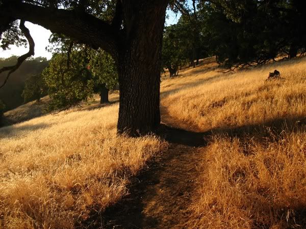
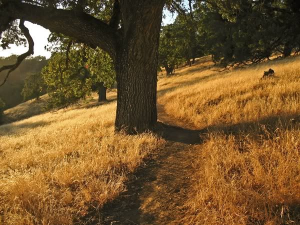
Anyway, here is a picture of an oak I took at Coe State Park. I wanted the grass to appear golden so I metered to get that result. When I got home I saw that the shadows were way too strong.


None of my endeavors with Photoshop 7.0 could resurrect this image. Then along came CS3 with the shadow/highlights feature and the image came back to life as I remembered it. I lightened the shadows to bring out the bark in the tree but this caused the grass to pale. So I darkened the highlights which caused a color change as well. It's not where I would like it to be but it's better than what I started with.


Try this feature after you get your CS3, Roger. It's real easy to pick up also.

test 3

Stickers - 1-4-2010 at 11:10 PM

This photo is a direct attachment non hosted but with low resolution it is only 40kb.

I finally figured out how to do this large enough to be useful. Just set the size big with resolution small.

Now if I had done this last month when I took the picture with my cellphone you could have saved money on a Pacifico at Wahoo Fish Tacos.

[Edited on 1-5-2010 by Stickers]

wahoo 700 low rez.jpg - 39kB

Pompano - 1-5-2010 at 07:42 AM

Muchas gracias one and all. There's a wealth of information and helpful advice/opinion in the preceding posts. I am busy wading through all the suggestions.

Hopefully I will repay your kindness with better photos of Baja in the coming months...or wherever I and my camera are rambling!

p.s. stickers, looks like you've got it sized right to fit the screen. And a good choice of beer, too.

capt. mike - 1-5-2010 at 08:10 AM

http://www.gimp.org/

Rogelio - this is free and does most of photo shop for less, free.

DENNIS - 1-5-2010 at 08:20 AM

Quote:
Originally posted by capt. mike
http://www.gimp.org/

Rogelio - this is free and does most of photo shop for less, free.


I didn't go through this but, here's a tutorial to go with GIMP. Might be fun.

http://gimp-savvy.com/BOOK/index.html

Pompano - 1-5-2010 at 08:27 AM

Thanks Mike and Dennis...Doug had also suggested GIMP. I've checked it out and will be using it.